Hey Period

Summary
Hey Period is healthcare platform that enables women to track their health through blood tests using menstrual blood. To build a waitlist for potential customers during their R&D process, the startup needs a fresh, trustworthy brand.
As the sole product designer, I worked with the Head of Product to create the startup’s brand identity, marketing website, and mobile UI design.
Client: Hey Period
Role: Product designer
Timeline: 2 months
Tools: Figma
Skills: User research, brand design, web design, mobile design
User research
I began with user research, interviewing women about their experiences with period tracking and healthcare products.
The target users are 18-35 year old women who have periods and want to track their health for various reasons. Below are the user personas we used to guide the design process.
Brand identity
During my research, I found that Hey Period's target audience wants a trustworthy brand that also offers them fun and a sense of community. In addition, the Hey Period team wants to build a brand that is distinct from other women’s health startups.
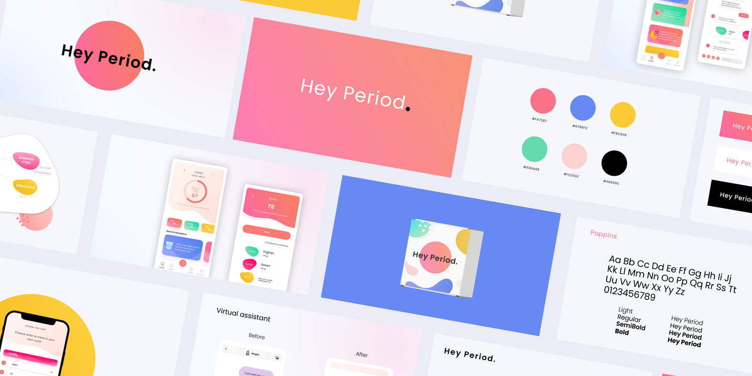
I distilled these ideas into mood boards and came up with a colorful palette that conveyed energy and vibrancy. The primary neon reddish pink color is similar to the primary color of the most popular period tracking app, Flo, evoking a sense of familiarity and trustworthiness. The other colors work in combination to create a whimsical feel that communicates the playfulness of Hey Period.
Having a bubbly, playful aesthetic, the font Poppins works well with the palette and still remains clear and easy to read. The resulting branding is youthful, playful, and trustworthy—all qualities that accurately reflect Hey Period.
Marketing website
After it was clear what the brand should be, I designed Hey Period's new marketing website to bring it to life. Working with the Head of Product, I created all assets showcasing Hey Period's features and refined the marketing copy.
Mobile design
I came onboard Hey Period as the team was creating a mobile app to accompany the blood testing kit. They had created low-fidelity mockups and needed visual design help to create a high-fidelity prototype compatible with the branding. Below are the before and after of the mobile design.
Learnings and reflections
One key learning I had from the experience is adaptability. As a young startup, Hey Period had changing priorities — weekly, even daily. I learned to adapt my designs to the ever-changing demands of the team and developed a flexible workflow.
With time and budget constraints, I also did not have as much time as I’d have liked to interact with users. I learned to be resourceful through secondary research to inform my design.
Overall, it was a thrill to work with an innovative company at the cutting edge of science, and I’m looking forward to seeing the product go to market.


